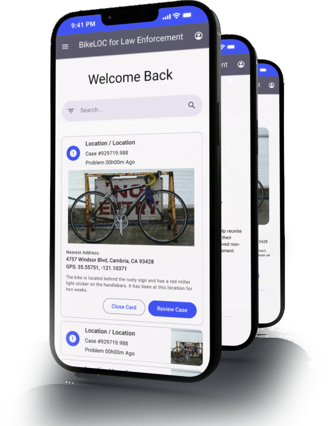
Case Study: BikeLOC Community Bicycle Recovery Initiative

BikeLOC is a tool to that lets anonymous heroes help reunite lost, stolen, or abandoned bicycles with their owners. This app also supports local non-profits and reduces workload by law enforcement entities by saving time and money.

Cell phone featuring the BikeLOC welcome screen

The Problem

Bike theft is one of the most common crimes occurring in the world yet in many places reporting a theft is difficult and police departments are frequently understaffed to investigate reports this type. At the same time people who found bikes are rarely reunited with their owners due to not having a clear path of return.

The Goal

Create a way for people to quickly report lost, stolen, or abandoned bicycles and reunite them with their owners while reducing police workload by incentivizing local bicycle non-profit groups to assist in recovery efforts.


A pen and notepad with wireframing

My Role

UX Designer performing app research and design for BikeLOC Recovery App for delivery to engineering.

Responsibilities

Conducting interviews, paper and digital wireframing, low and high-fidelity prototyping, conducting usability studies, accounting for accessibility, and iterating on designs.

User Research

I conducted interviews and created empathy maps to understand the users I'm designing for and their needs. A primary user groups identified through research a mix of cyclist and joggers, non-profit / charity bicycle repair volunteers, and law enforcement supervisory staff with tight budgetary concerns.

This user groups confirmed the appreciation for a simple method of reporting and recovering lost, stolen, and abandoned bicycles but were overwhelmingly interested in the brevity of the reporting process, the ease of use during the recovery process, and the ability to customize the app and connect to existing reporting systems. These findings were combined into research personas.

Competitive Audits

A competitive audit was performed on competitor and adjacent apps to provided direction on gaps and opportunities to address.

Click here to view an example competitive audit.

Ideation

Based on the results of an affinity study, I completed an ideation exercise focusing on three goals:

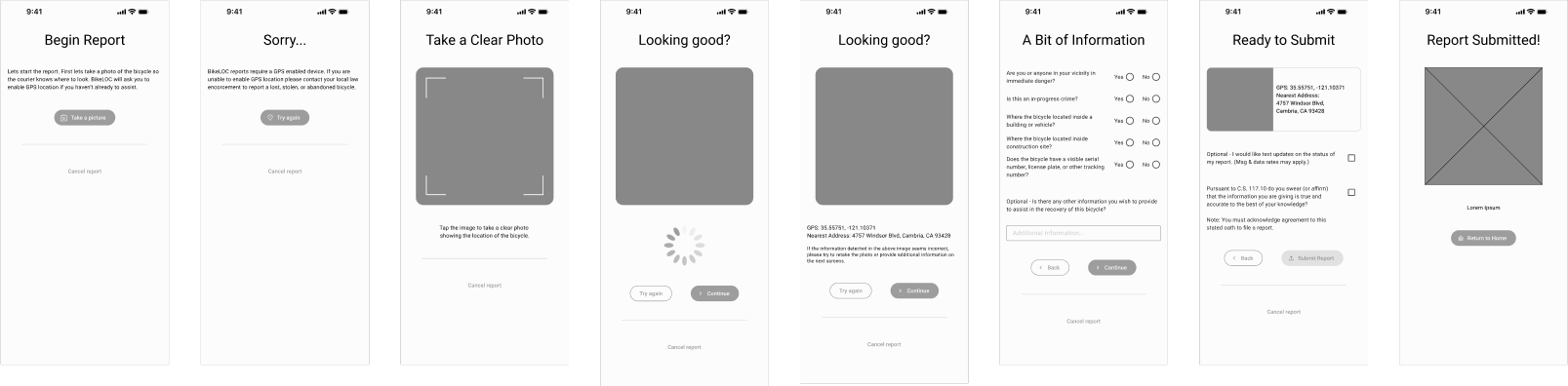
  • Make report completion process more user friendly.
  • Explain or illustrate the process for the user in a simple way.
  • Bring value to the user that does not exist is current apps.
Sticky notes on a post board

Wireframing and Usability

Combining data from user research, competitive audits, and ideation goals quick sketches and wireframes were used to execute a usability study.

Wireframe of the BikeLOC application

Usability Study

  • Study type: Moderated Usability Study
  • Location: Tampa, FL / Ybor City
  • Participants: 5-6 per module (3 modules)
  • Length: 15-25 minutes

Findings

  • Most users need a very clear and defined path to completing their report as most never have to file an official legal report
  • Some users were unable to find familiar functionality that they expected such as settings for accounts like in other apps
  • Almost all users immediately asked if the functionality to report stolen bikes would be added as a feature in the future
Two cell phone screens. One showing the BikeLOC app as a plain gray GUI with no iconography. The second showing the same screen with colors and refinement.

Usability Improvements

After extensive feedback about the user flow, the sign in page was moved to a separate screen so was no confusion as to what action to take. Friendly images and text were added to help further explain the process. Additionally - a overview of the app was added to the bottom with even more detail.

High Fidelity Prototype

The final high-fidelity prototype presented cleaner user flows for the reporting process. It also enhanced accessibility and added additional information to help guide users.

An example user flow of BikeLOC showing the refined colors and process

Accessibility Considerations

Special care was taken to ensure that the entire app meets AAA Contrast (Enhanced) ratio of 7:1 for “regular” sized text and 4.5:1 for large scale text.

Buttons, toggles, and other mechanisms all meet the target size inputs of at least 44 by 44. 

Website certified by DHS trusted testing program to 503 accessibility standards (AA) required for government and public service use.

Responsive Design

Considerations were made for the administrative area for all screen sizes and functionality can be accessed via the native or web app on mobile devices, tablets, and standard computers screens.

A laptop, tablet, and cell phone displaying the BikeLOC app.

What I learned:

While interviewing participants in user studies I was surprised to learn about the enthusiasm for all prospective users of the app to participate even if the only incentive was to better their local community. Hopefully this would lead to a willingness to adopt the app if promoted locally at an appropriate level.

Impact: 

The app makes reporting and recovery of lost, stolen, or abandoned bicycles more faster and more accessible to than the existing methods of reporting (phone calls, PDFs, and web-forms with little mobile support.) It also enables those with visual or hearing impairments to make reports more easily than previous methods.