Case Study: Dieu East Gallery App

Dieu East Gallery is a small co-op art gallery in St. Petersburg, Florida. The gallery is entirely funded by the public and predominantly features lesser known and local artists with occasional off-season exhibits on loan from larger collections. The gallery targets budget-minded individuals who still wish to experience local and world artworks without breaking the bank.

Cell phone featuring the Dieu West welcome screen

The Problem

The gallery has a low staff budget causing delays and long lines for visitors when checking in for the limited gallery tour slots. In addition tours are not currently accessible to persons who are visually or hearing impaired.

The Goal

Design an app for Dieu East Gallery that allows visitors a faster way to check in to guided tours and an option to take self guided tours which are also accessible to those with impairments.


A pen and notepad with wireframing

My Role

UX Designer performing app research and design for Dieu East Gallery for delivery to engineering.

Responsibilities

Conducting interviews, paper and digital wireframing, low and high-fidelity prototyping, conducting usability studies, accounting for accessibility, and iterating on designs.

User Research

I conducted interviews and created empathy maps to understand the users I'm designing for and their needs. A primary user group identified through research was a mix of frequent gallery visitors with higher disposable income and infrequent visitors with tighter budgetary concerns.

This user group confirmed the appreciation for alternative check in but was overwhelmingly interested in the self-guided tour feature. Other user problems included accessibility concerns, preference for virtual tickets / passes, and preference to get the most of their visit compared to other gallery options.

Competitive Audits

A competitive audit was performed on competitor and adjacent apps to provided direction on gaps and opportunities to address.

Click here to view an example competitive audit.

Ideation

Based on the results of an affinity study, I completed an ideation exercise focusing on three goals:

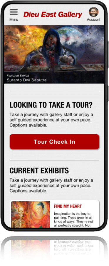
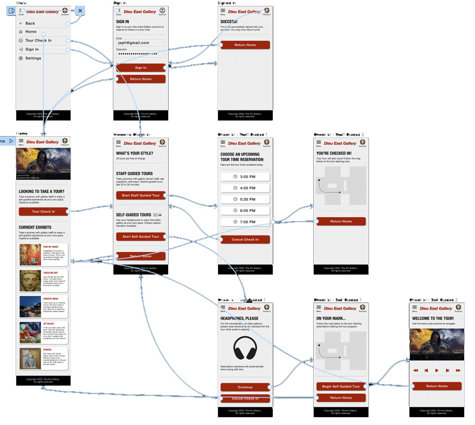
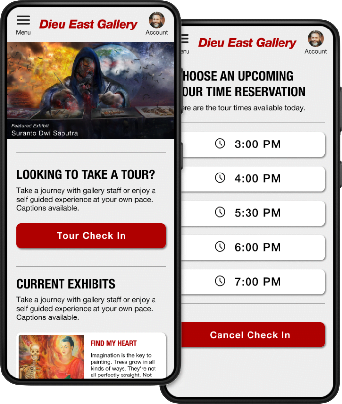
  • Visitors don’t want to waste a lot of time waiting in line to check in for a tour to start.
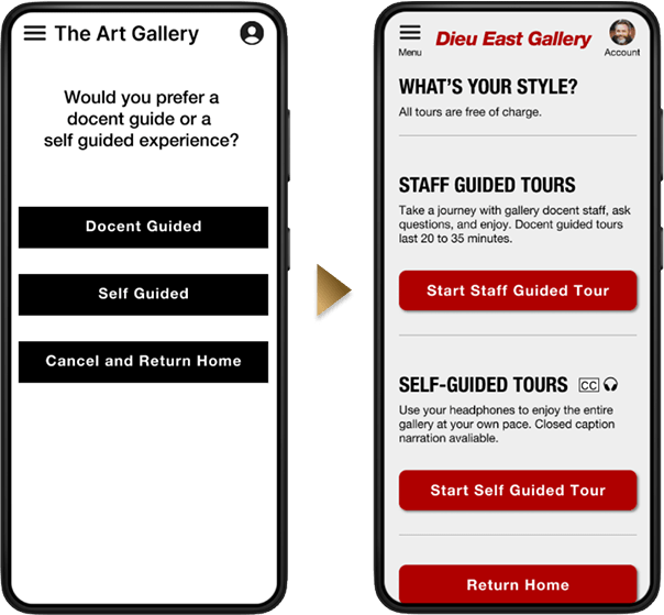
  • Traditional tours are unable to accommodate visitors with visual or hearing impairments.
  • Visitors prefer to have self-paced access to the gallery’s core features.
Sticky notes on a post board

Paper Wireframes and Usability

Combining data from user research, competitive audits, and ideation goals quick sketches and draft iterations of each screen of the app on paper were used to execute a usability study.

Wireframe of the Dieu West application

Usability Study

  • Study type: Moderated Usability Study
  • Location: Tampa, FL / Ybor City
  • Participants: Six total participants
  • Length: 15-25 minutes

Findings

  • All users commented that the button actions were vague
  • Some users wish they knew about the self-guided requirements in advance
  • Some users found the language convoluted
Two cell phone screens. One showing the Dieu West app as a plain gray GUI with no iconography. The second showing the same screen with colors and refinement.

Usability Improvements

After extensive feedback about the terminology, brief descriptions were added before all buttons to better describe the type of tour and tour requirement options so there were no surprises on the next screen. The white background was replaced with a slightly tinted color to reduce eye strain as well.

High Fidelity Prototype

The final high-fidelity prototype presented cleaner user flows for the tour check in process. It also enhanced accessibility and added additional information to help guide visitors.

An example user flow of Dieu West showing the refined colors and process

Accessibility Considerations

Special care was taken to ensure that the entire app meets AAA Contrast (Enhanced) ratio of 7:1 for “regular” sized text and 4.5:1 for large scale text.

Buttons, toggles, and other mechanisms all meet the target size inputs of at least 44 by 44. 

Website certified by DHS trusted testing program to 503 accessibility standards (AA) required for government and public service use.

Responsive Design

When designing the app, our main focus was on providing an exceptional user experience for all users, regardless of the device they are using. We took great care to ensure that the app's areas are fully responsive and accessible across different screen sizes, including mobile devices, tablets, and standard computer screens. This means that users can access and utilize the app's functionality seamlessly, whether they prefer the native app or the web app. By prioritizing user-centered design, we aim to empower administrators with a consistent and efficient experience across multiple devices, enabling them to effectively manage and interact with the app's features.

A laptop, tablet, and cell phone displaying the Dieu West app.

What I learned:

While interviewing participants in user studies I was surprised to learn that even regular visitors to galleries and museums may not necessarily be familiar with the typical terminology of the industry and it is always best to use descriptive yet simple copy as much as possible.

Impact: 

The app makes Dieu East Gallery much more accessible to visitors and enables those with visual or hearing impairments to enjoy the exhibits equally where they may have been unable to do so before. The app also lays a strong visual and functional framework allowing for expansion of other features.