Case Study: Spectrum Paint eCommerce App and Website

Discover a new paint store website offering high-quality paints, vibrant color palettes, and innovative tools. With a user-friendly interface, find the perfect paint with ease, explore inspiring galleries, and access expert advice for stunning results. Enjoy secure online shopping and fast delivery to unlock endless possibilities for transforming your space and experiencing the joy of painting.

Cell phone featuring the Spectrum Paint welcome screen

The Problem

The goal is to overcome the challenge of a limited online presence and provide a dedicated paint store website for customers in the painting industry. This website will showcase the business's range of high-quality paints, captivating color palettes, and innovative tools, fostering creativity. The objective is to offer expert advice, step-by-step tutorials, and valuable tips to guide customers in achieving exceptional painting results. By enabling online shopping capabilities and secure transactions, the goal is to enhance convenience, access to products, and overall customer satisfaction, driving business growth and success.

The Goal

The goal is to create a user-centric paint store website, showcasing a wide range of high-quality paints, color palettes, and tools for informed choices. Provide valuable resources, tutorials, and advice to support customers in achieving exceptional painting results. Enable secure online shopping for a seamless purchasing experience. Establish the business as a leading destination for painting needs, expanding the customer base through an enhanced online presence.


A pen and notepad with wireframing

My Role

UX Designer performing app research and design for Spectrum Paint eCommerce Website and App to deliver to engineering.

Responsibilities

Conducting interviews, paper and digital wireframing, low and high-fidelity prototyping, conducting usability studies, accounting for accessibility, and iterating on designs.

User Research

I conducted interviews and created empathy maps to understand the users I'm designing for and their needs. A primary user groups identified through research a mix of Professional Painters, DIY Enthusiasts, and Interior Designers.

Professional Painters: Professional painters form a crucial user group as they rely on high-quality paints, specialized tools, and a wide range of color options to meet their clients' demands. They would utilize the website to explore product options, access technical specifications, and gather information on new painting techniques. The website can provide them with a convenient platform to streamline their purchasing process, access bulk ordering options, and stay updated with the latest industry trends.

DIY Enthusiasts: DIY enthusiasts, including homeowners and hobbyists, are another important user group. They often seek guidance, inspiration, and resources to tackle painting projects in their homes or personal spaces. The website can offer them a wealth of information, such as color selection guides, step-by-step tutorials, and practical tips for achieving professional-looking results. DIY users can browse through various paint options, read customer reviews, and gain confidence in their painting endeavors.

Interior Designers and Decorators: Interior designers and decorators regularly source paints, color palettes, and design elements for their projects. They rely on a comprehensive range of paints and tools to bring their creative visions to life. The paint store website becomes a valuable resource for them to explore different paint finishes, color schemes, and complementary products. They can access product specifications, compare options, and visualize the desired outcomes through color visualization tools. The website can also offer collaboration features, allowing designers to create project lists and share ideas with their clients.
Competitive Audits

A competitive audit was performed on competitor and adjacent apps to provided direction on gaps and opportunities to address.

Click here to view an example competitive audit.

Ideation

Based on the results of an affinity study, I completed an ideation exercise focusing on three goals:

  • Accurate color matching and exploration.
  • Paint calculator and integrated shopping.
  • Virtual room visualization for paint colors.
Sticky notes on a post board

Wireframing and Usability

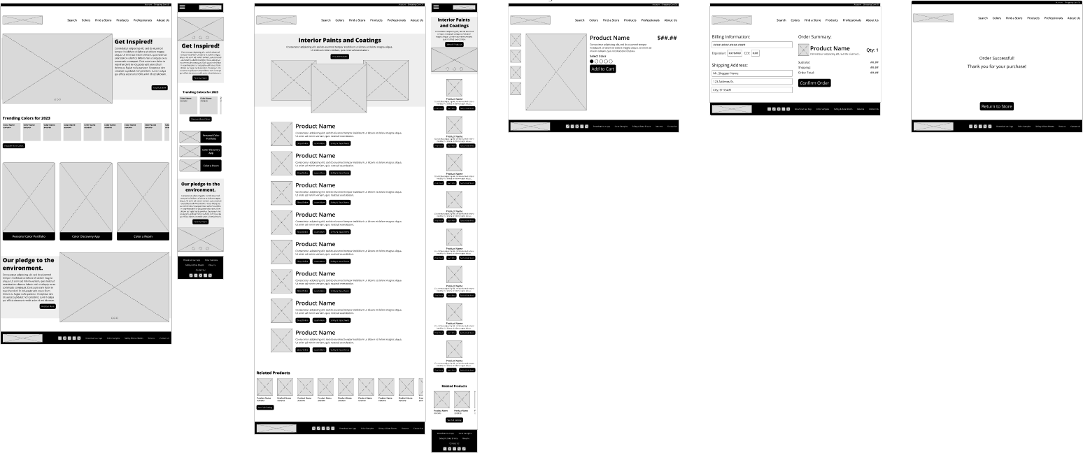
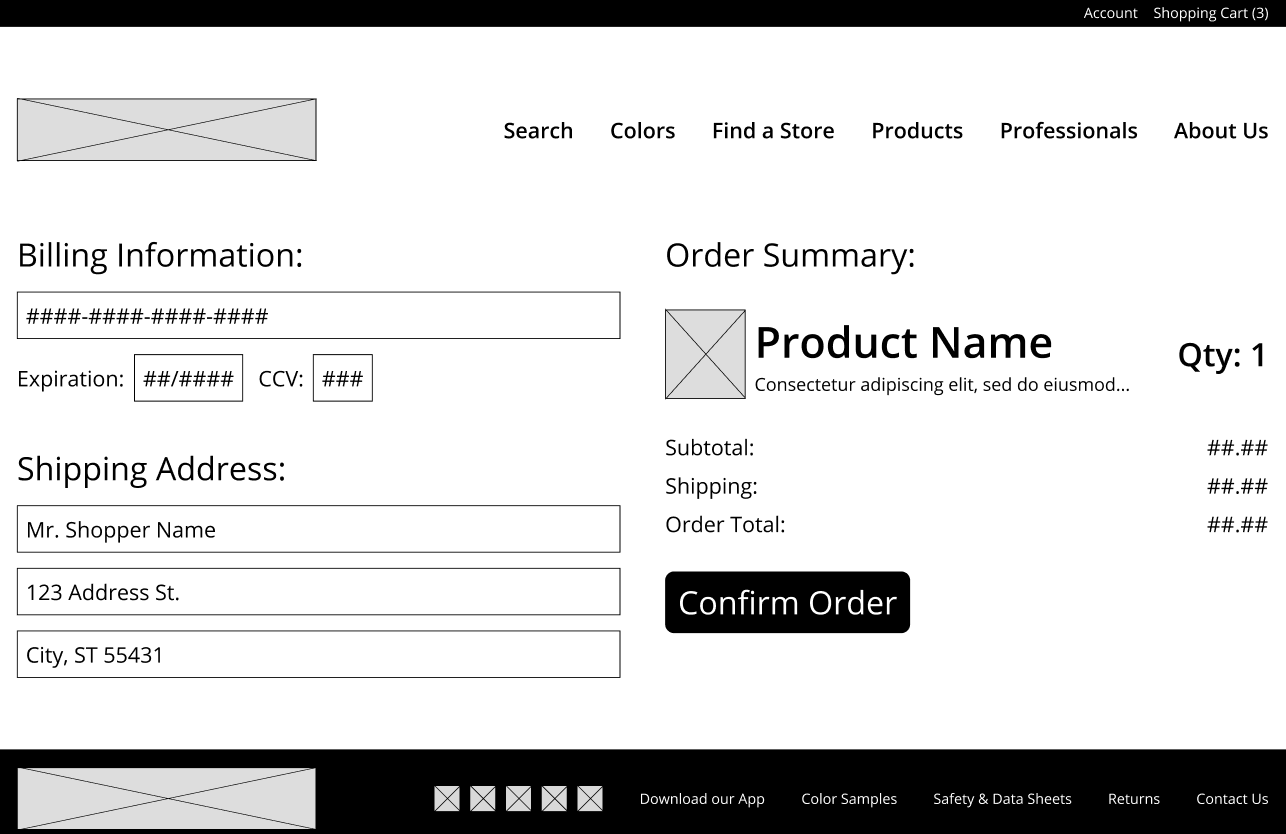
Combining data from user research, competitive audits, and ideation goals quick sketches and wireframes were used to execute a usability study.

Wireframe of the Spectrum Paint application

Usability Study

  • Study type: Moderated Usability Study
  • Location: Tampa, FL / Ybor City
  • Participants: Six per task (3 tasks)
  • Length: 15-25 minutes

Findings

  • A complicated or lengthy checkout process can be frustrating for users. Difficulties in entering shipping information, making payment, or navigating through multiple steps can deter users from completing their purchase.
  • Users may struggle with the challenge of accurately perceiving paint colors on digital screens. The representation of colors on the app may differ from the actual paint shades, leading to discrepancies when making color selections.
  • Difficulty in confirming the availability of a specific paint color or product in their desired quantity or size. When users have a particular paint color or product in mind for their project, it can be frustrating and time-consuming to navigate through various product listings or search filters to find the desired item.
Two cell phone screens. One showing the Spectrum Paint app as a plain gray GUI with no iconography. The second showing the same screen with colors and refinement.

Usability Improvements

After extensive feedback about the user flow several changes were made to the website and app. Some of them service level and some at the app level. These included:

  • Streamline checkout process by reducing steps and eliminating unnecessary information fields.
  • Implement clear progress indicators for transparency and guidance.
  • Provide the option to order physical paint color samples or swatches through the app.
  • Include detailed color descriptions and information for informed decision-making.

High Fidelity Prototype

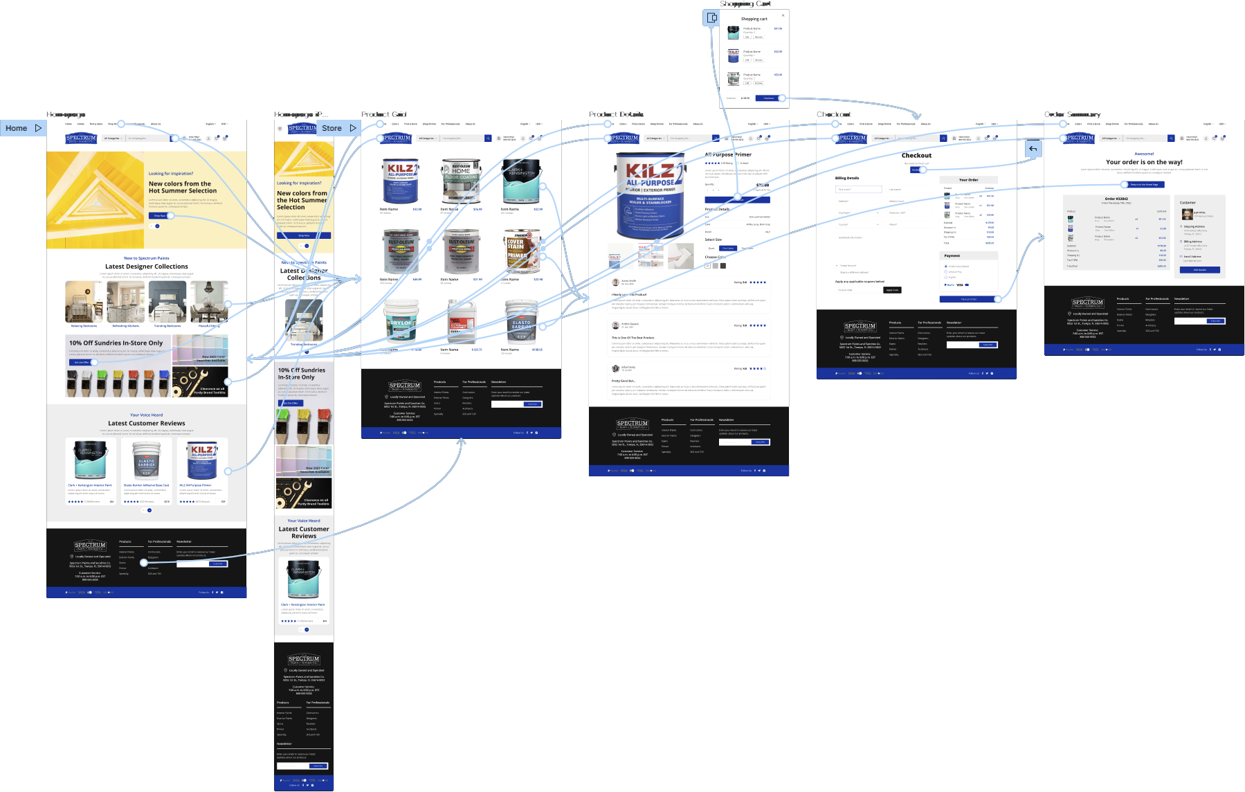
The final high-fidelity prototype presented cleaner user flows for the reporting process. It also enhanced accessibility and added additional information to help guide users.

An example user flow of Spectrum Paint showing the refined colors and process

Accessibility Considerations

Special care was taken to ensure that the entire app meets AAA Contrast (Enhanced) ratio of 7:1 for “regular” sized text and 4.5:1 for large scale text.

Buttons, toggles, and other mechanisms all meet the target size inputs of at least 44 by 44. 

Website certified by DHS trusted testing program to 503 accessibility standards (AA) required for government and public service use.

Responsive Design

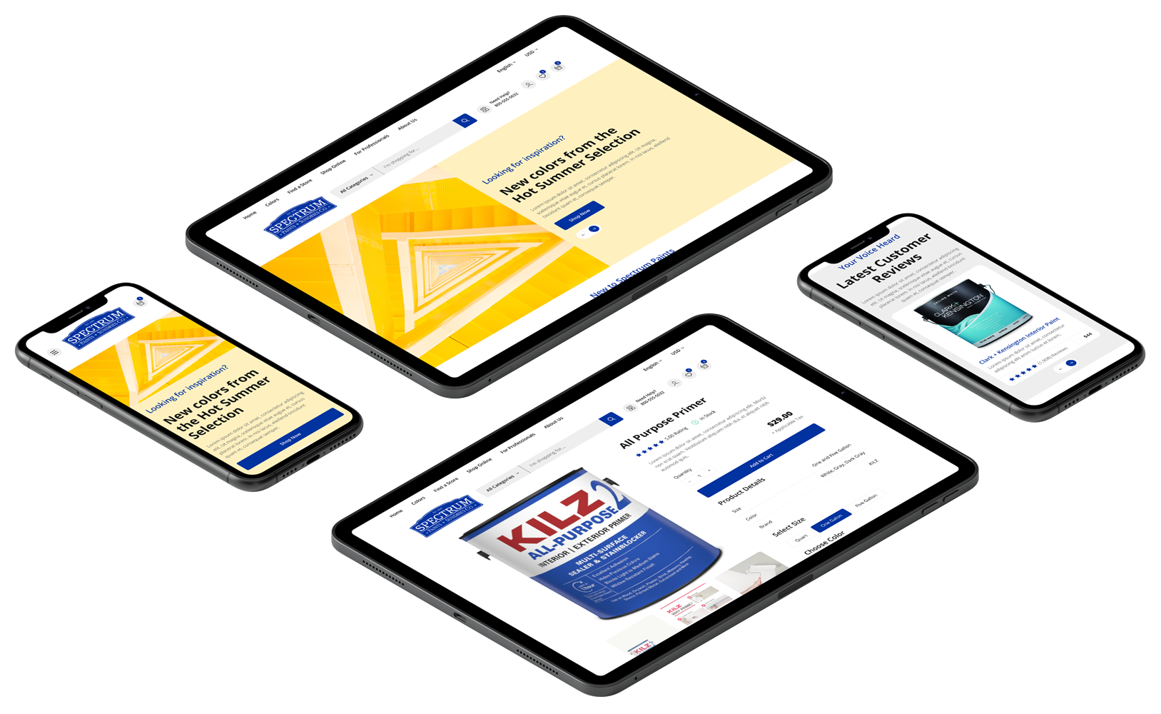
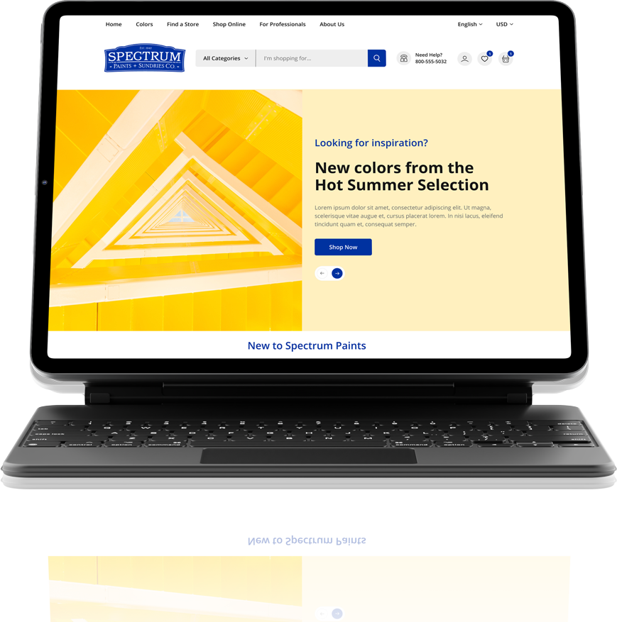
Considerations were made for the administrative area for all screen sizes and functionality can be accessed via the native or web app on mobile devices, tablets, and standard computers screens.

A laptop, tablet, and cell phone displaying the Spectrum Paint app.

What I learned:

You might be surprised to learn that users of a paint store app come from diverse backgrounds and have varied levels of experience in painting. Some users might be professional painters seeking specific professional-grade products, while others could be DIY enthusiasts looking for guidance and inspiration. Additionally, the app may attract users who are interested in exploring unique color combinations and experimenting with different painting techniques.

Impact: 

The store management was please with the app for its enhanced user experience through tailored design and features, increased customer engagement with personalized recommendations and notifications, expanded market reach beyond physical locations, and competitive advantage by providing a seamless shopping experience.